Revenue Distribution: A new way to visualize your waterfall
Revenue Distribution: A new way to visualize your waterfall
What’s the ideal way to visualize your waterfall’s revenue contribution?
Introduction
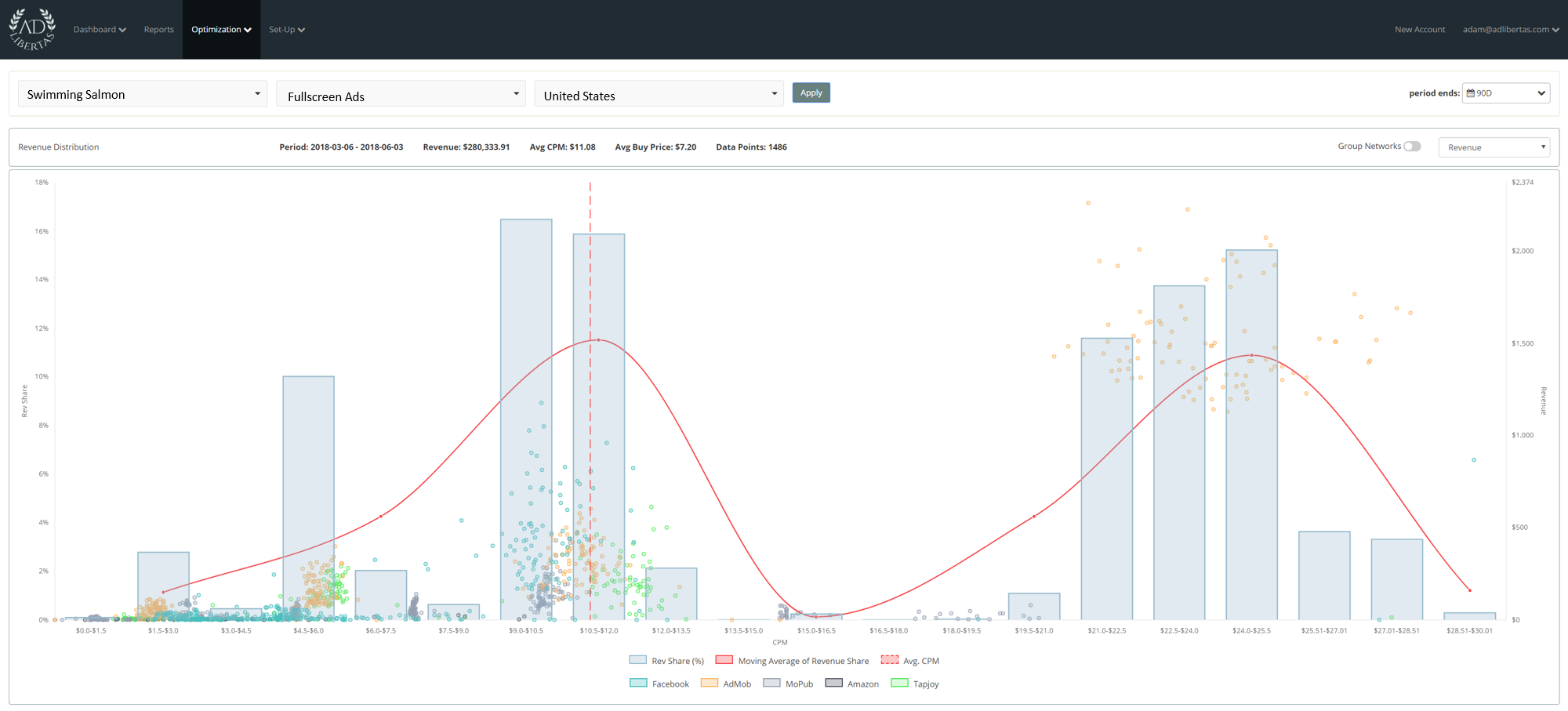
The AdLibertas revenue distribution chart is a method of looking at your advertising earnings over time, giving you insights to revenue impact, and opportunity for price advancement. Don’t let the complexity fool you, this tool has proved to be an extremely effective and powerful tool for publishers to identify and execute on advanced selling strategies.
How it works
We’ve put together a video walk-through on using the tool as well as some summaries below:
- View revenue impact per network -How much overall revenue does MoPub deliver at the $.50 floor?
- Drill into price changes: why did ARPU fall? Did a network stop buying?
- Identify buy clustering; indicative of potentially higher prices points
- View impression vs. revenue impact – want to see what percentage of revenue would be impacted with setting hard floors at $.05?
- Find buyer white-space, indicating new-buy opportunities.
Notes on usage:
- Because this is a granular in-depth view into a single segment’s inventory, you are limited to a single segment (app > ad unit> geo.) it wouldn’t make much sense to view the comparison of two widely differing geos in a single historical view as the blending averages would reduce effectiveness of trend analysis.
- For performance reasons the chart will only return 2500 individual data points.
- Impressions use network-reported impression counts.
- Fill rate uses MoPub request & impression counts.